Not just for kids…
I’ve been really busy, lately. I picked up some really wonderful and interesting books to illustrate, which I can post more about later. I have three or four of my own authored projects that i’ve been sitting on and that i’m getting back to work on. But mostly i’ve been making a LOT of spec work, portfolio work. Not the pencil-drawings and sketchbook stuff i’ve been doing for the past few years. But i’ve been giving myself projects, assignments. This burst of work has coincided, very un-coincidentally, with my teaching a class at Tyler School of Art as well as signing up for Mike Lowery’s Getting Paid to Draw class last March.
My goal with the teaching was to get out of my studio and spend some face-time (as opposed to FaceTime) with humans, and to sort of focus my energies along figuring out what I actually know after 30 years of being an illustrator, and wondering if I have anything to offer. Ostensibly, when one teaches, it’s clear that one knows more than them being taught. And while of course that was true, I was pretty surprised (though I kind of know this was the case) to realize all the things I did not know. For example, i’ve been using Photoshop since 1989. I think it was v2.0. This is Photoshop before layers, even, which were introduced in 1993 with v3, while I was in fact working at Adobe. Every once in a while I notice that I use Photoshop more or less as if it was stuck on version 4 or 5. I was very late to the game learning to use brushes. And I have never bothered with 90% of the filters. And I still don’t know what a library or a property is. Whatever. So when, in April, my students at Tyler showed me what is a “mock-up,” my mind as blown. I was showing them how to take a logo and manually wrap/warp it around a picture of a coffee mug, and they’re all kind of giving me these side-eye looks. One says, Brian, do you know what a mock-up is? And I reply, yes, that’s what i’m showing you. And they replied, no. No you’re not. We’re talking like smart layers and fancy auto backgrounds and floating shadows. I made a mental note to google this miracle.
The very next day I was watching one of Mike Lowery’s videos for the Getting Paid to Draw class, and what was the subject of this video? Mock-ups! It was like being told there is a cave of gold in your backyard, and you had no idea!
Needless to say, i’ve gone down that rabbit hole.
So let’s fast-forward now to the real point of this blog post, which is that I’m making a lot of new work, and trying to convince the world that I know how to draw pictures and design things — no, not just know how, but that i’m good at it — for adults. And what better things to make for adults than booze! I’ve always wanted to design beer cans, and wine labels, and gin, and whiskey and you get the idea. Sacha and I like us a cocktail, and I buy wine because of the label designs. So when Mike’s class assignment was to pick a ‘dream client’ and make work to aim at that dream client to get work with that dream client, I chose booze labels and packaging. Just around the time that the Getting Paid to Draw class ended, and this assignment was being worked on by the other participants, I had to catch up on a book i’m illustrating, and focused on that for three weeks. But I sketched and thought and came up with ideas in the meantime, and this last week i’ve been busy making mock-ups. So here we go!
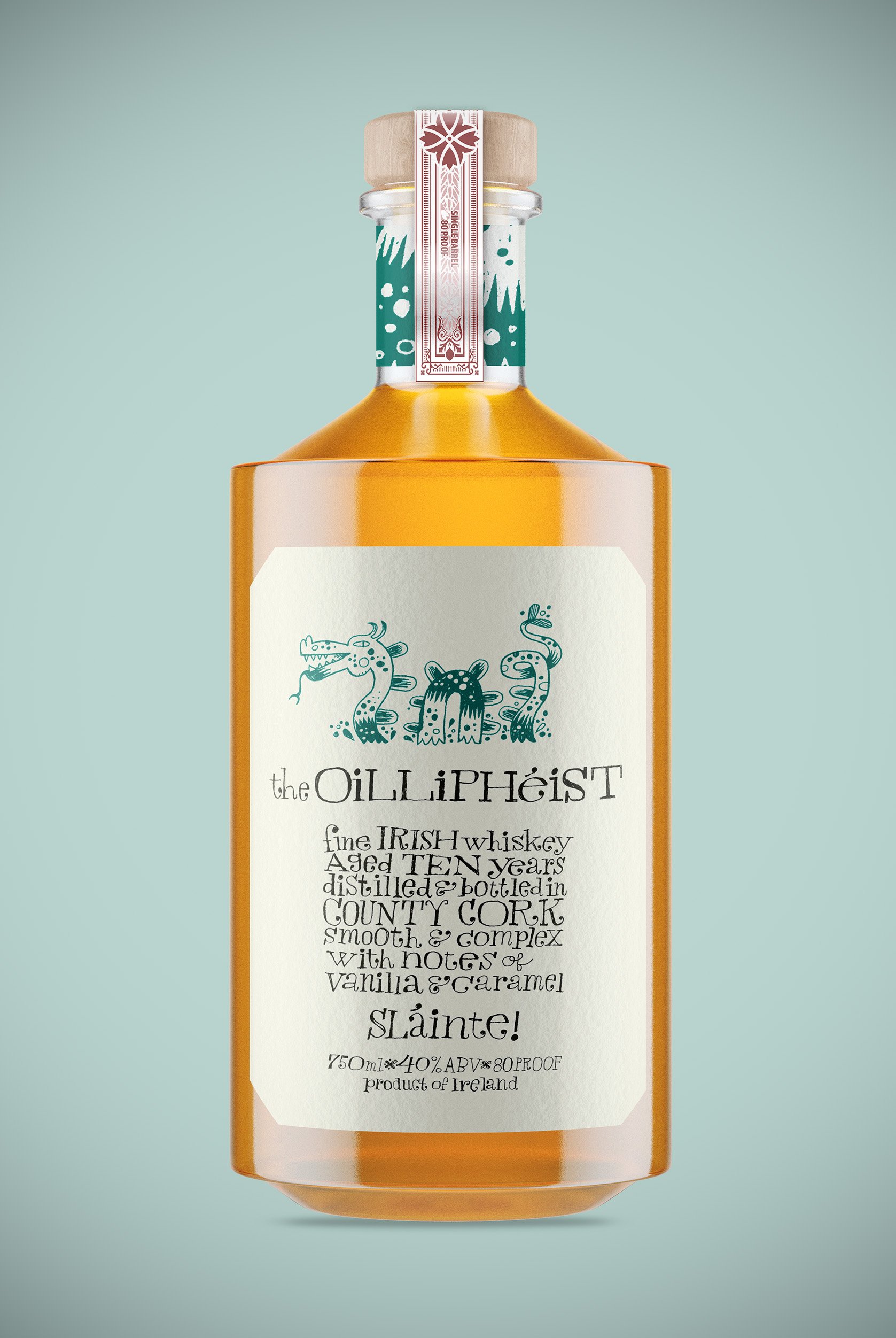
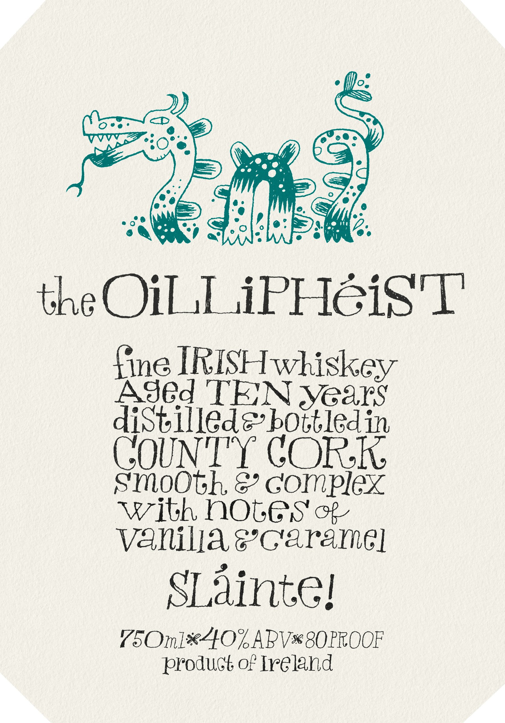
The Oilliphéist is a mythical sea-serpent from Irish legend. I’d been looking for a good name for an Irish whiskey, and when I came across this thing, I knew I had it. I originally depicted the monster as a set of tentacles, dragging a ship to the bottom of the sea, but realized that is a Kraken, and it’s already a weird-tasting rum. My beast is a serpent. I also re-discovered pen-and-ink a few weeks ago and wanted to draw this thing, and the type, traditionally.
Next item in the booze aisle is Tequila:
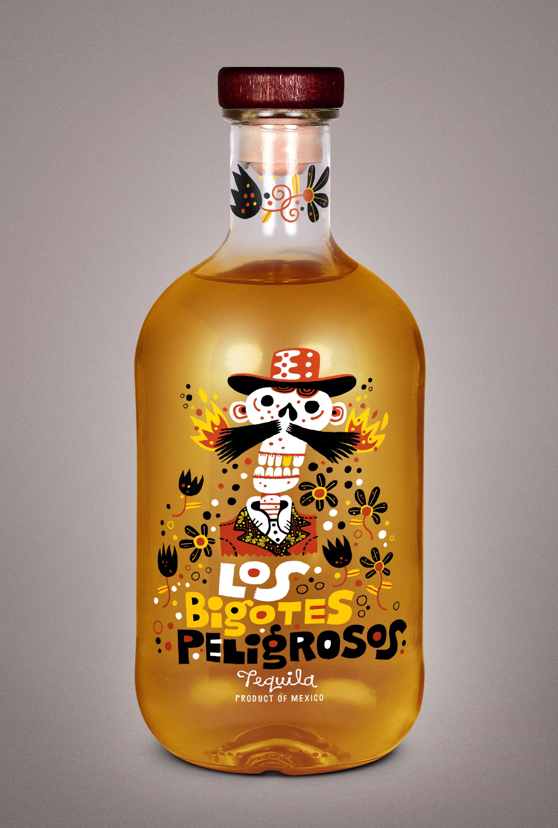
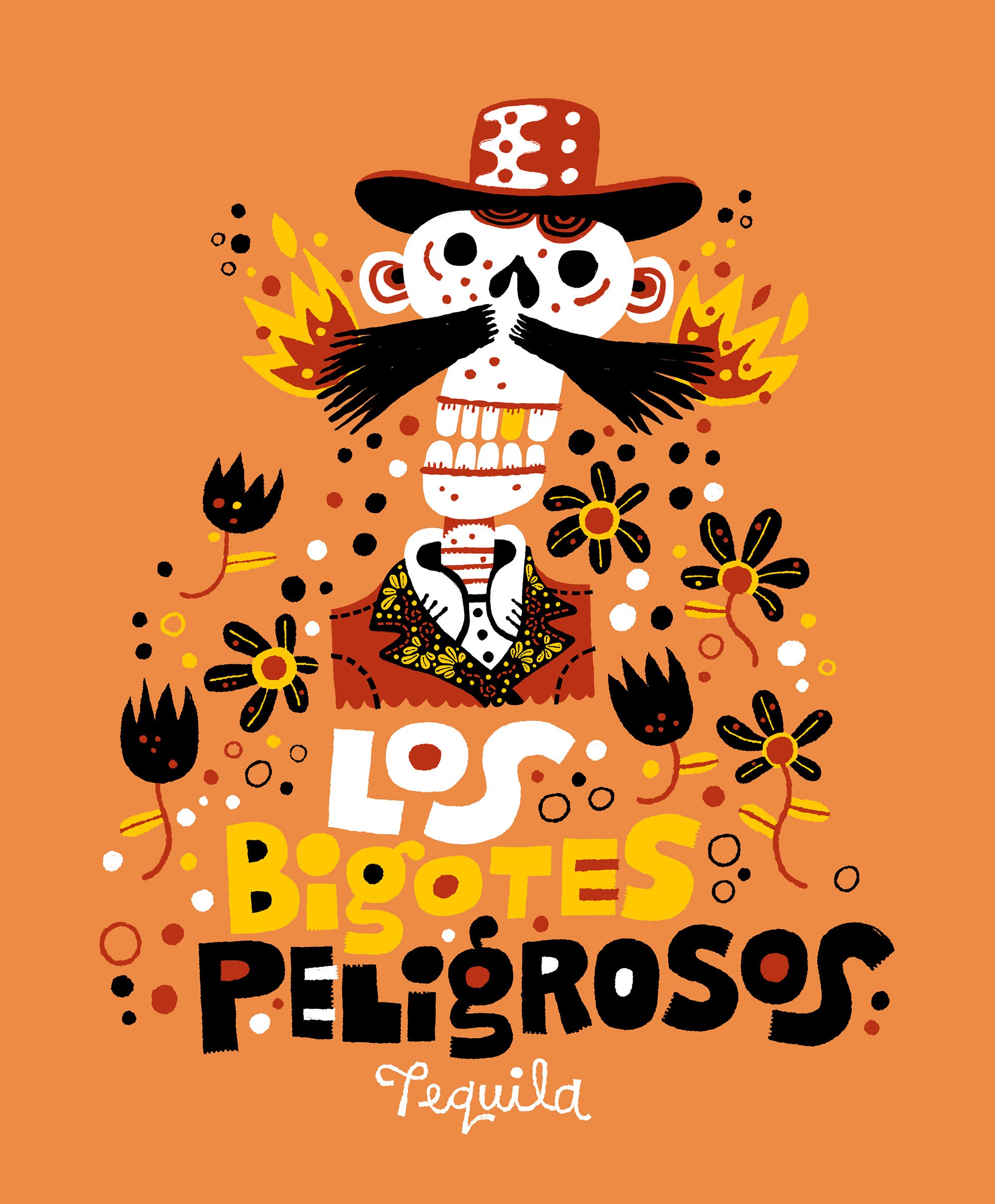
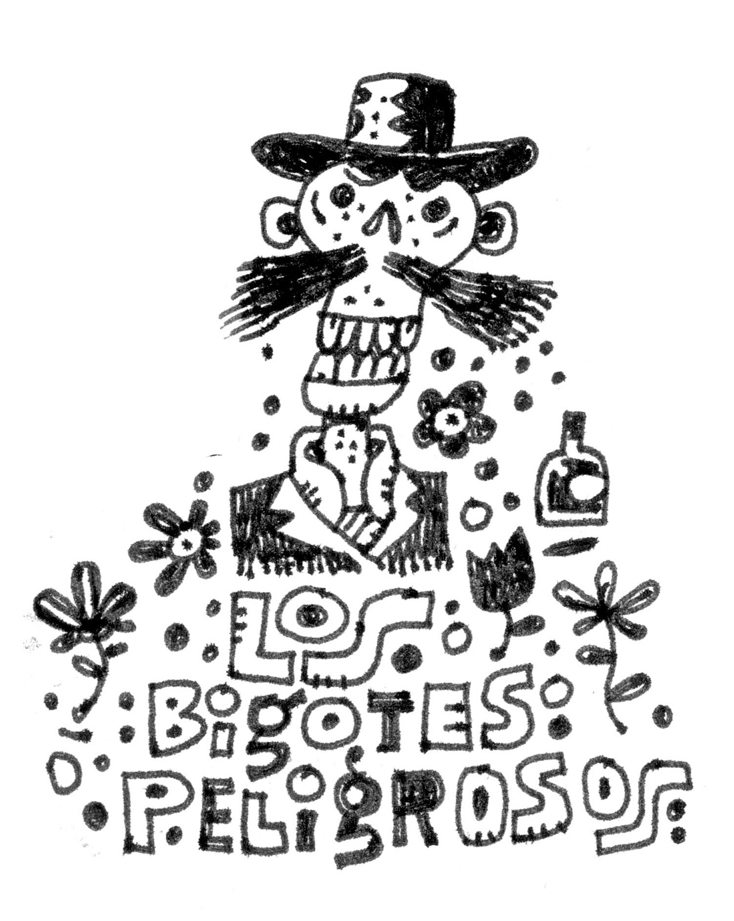
The past few years, i’ve occasionally added to a series of pieces called “Dangerous Moustaches,” which involve drawings of skull/skeleton fellows, usually with mustaches, and a short description of how they died, also usually involving their mustaches. I have a lot of fun with these, and like a lot of the things i’ve been working on for the last three years or so, I wasn’t sure what to do with them. I’d considered making wood-cut prints. Or a book of some kind. I was waiting for the bus after teaching one Wednesday and wondered what “Dangerous Mustaches” translated to in Spanish. The answer is “los Bigotes Peligrosos” which I loved, and I immediately knew it would be a good bottle design. I can easily imagine a series of these for añejo, reposado, and blanco tequilas, each with a different fellow having trouble with his whiskers. Stay tuned for those additions.
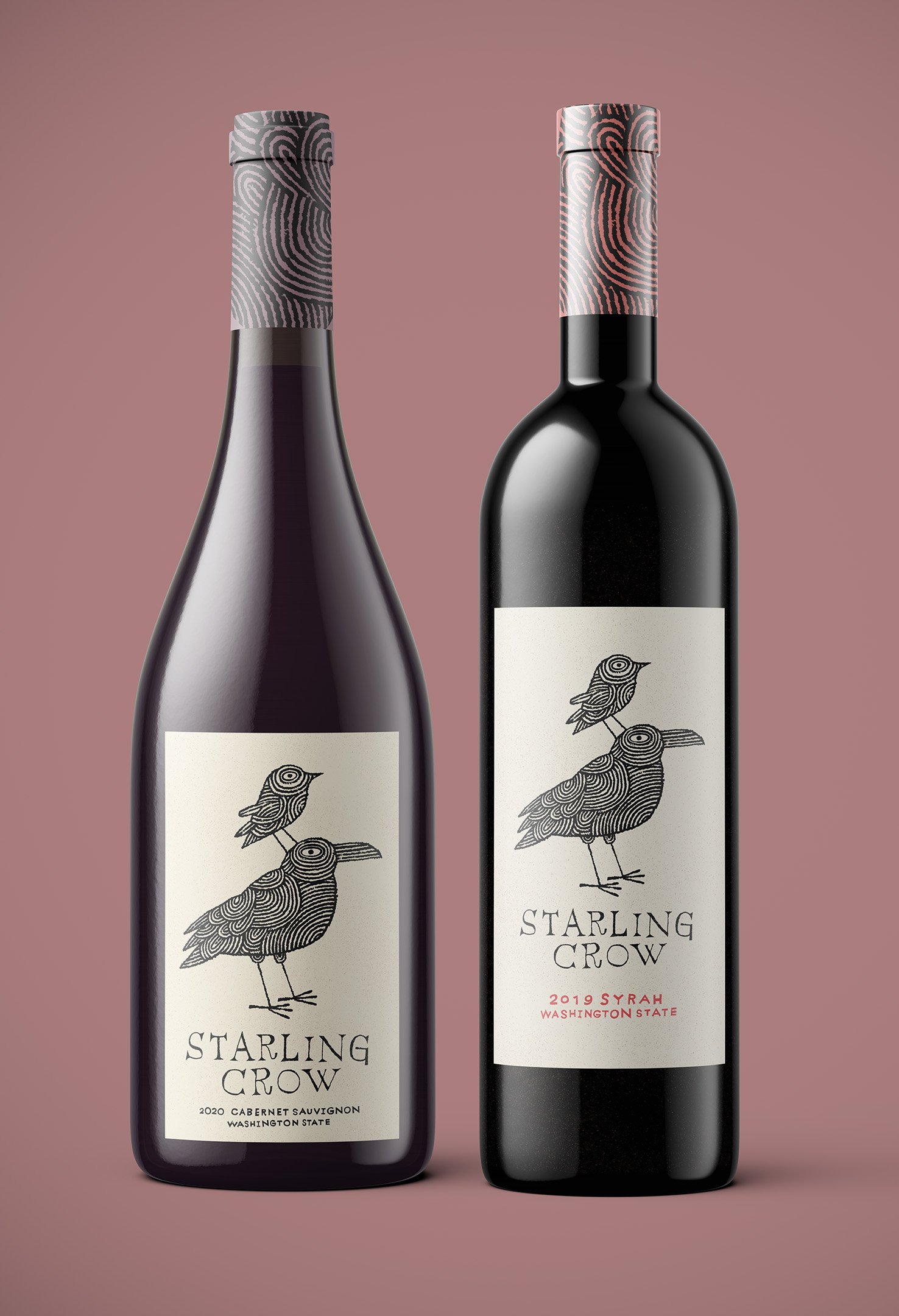
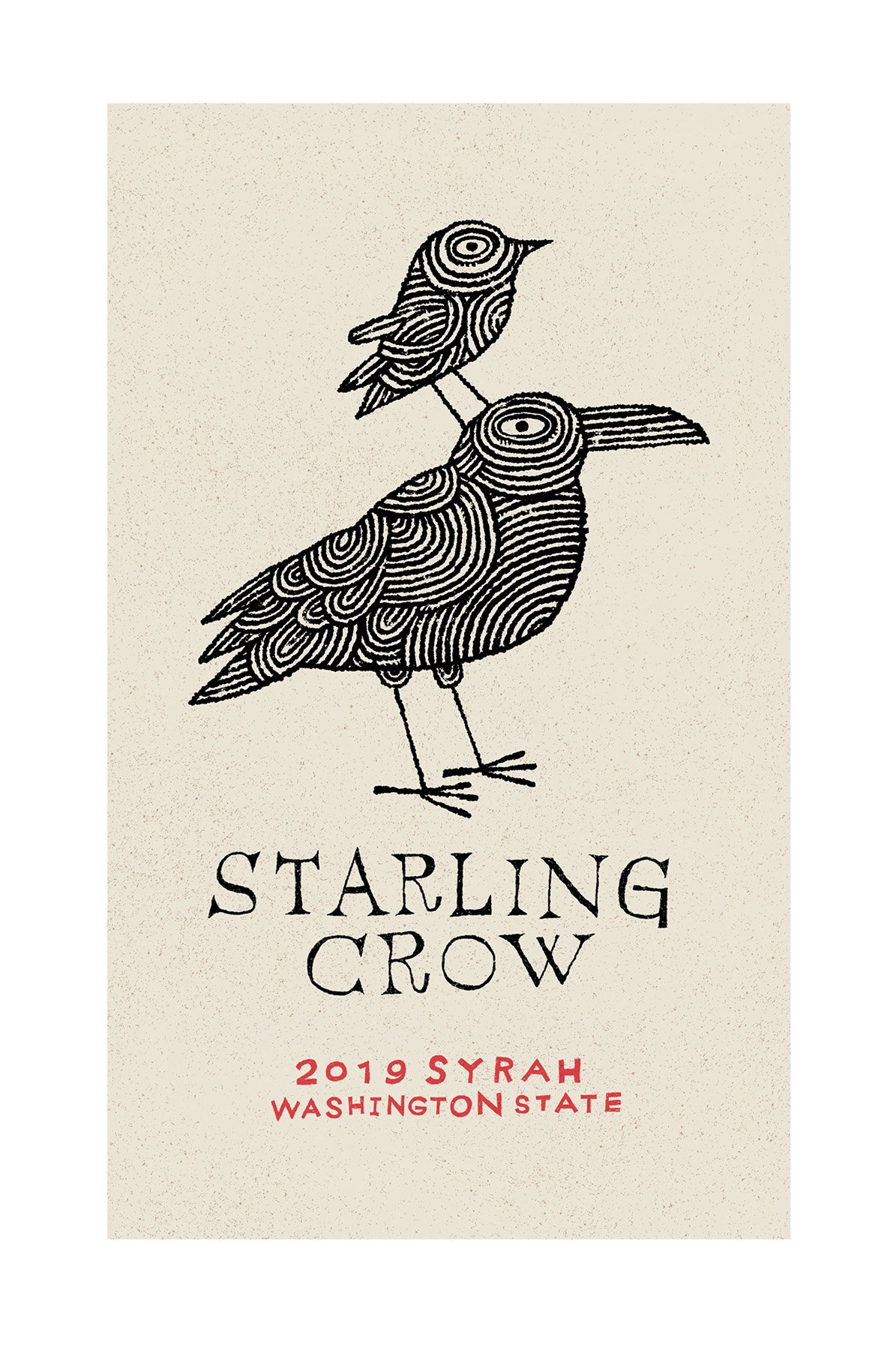
Third item on the aisle of wonder is wine:
I have lists of illustrations to work on that I update regularly. The idea is to 1. get all the good ideas down so I don’t forget them and 2. always have something to work on. Always. My sketchbooks are often a series of lists because of this.
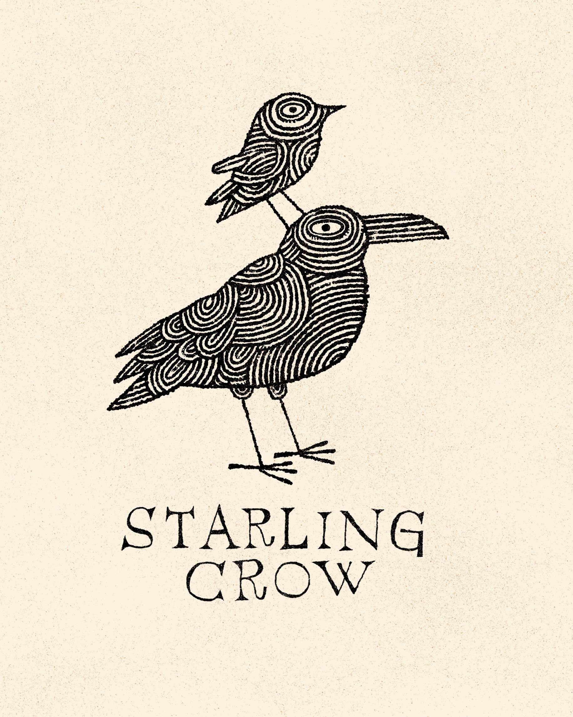
One of the lists is called “wine names” and I’m not sure when I wrote “starling crow” down, but when I noticed it again two weeks ago I knew what I was going to do with it. A starling, standing on a crow! Of course!
I was looking at a lot of Jeffrey Fisher illustrations last week, one of my long-time illustration heroes, and tried to channel Jeffrey’s amazing sense of design and ornamentation in the pattern in the birds here. Originally I figured the birds would be just black, but when I tried this playing out this last Friday, Sacha walked by and said “oh I love that!” This is always a sign to continue in the stated direction. The tough thing here was getting the hand-lettering right. I tried six or seven variations of hand-drawn type before hitting this one, which I knew right away was right.
Like with the tequila, I can imagine variations here. The birds filled-in with black. In color. It might be interesting to try collage versions. I like how a lot of vineyards have an anchor design and the riff on that for varietals, seasons, and special blends.
Generally, all of these, as well as so much of what i’ve been posting in the Illustration & Design section here lately, are to convince myself and others that I can draw pictures for people who are older than ten years old. I’ve been frustrated at times that I don’t get commissions for this sort of work. But when I look at my site, I think “why would I?” No one is going to look at Tinyville Town or The Space Walk and think “yes, I see a gin bottle,” or a restaurant menu, or even an editorial illustration for a newspaper. I remember telling my literary agent last year that I want to do science fiction book covers, and he suggested I sit down and design a few science fiction book covers. And he’s right. I realized that this year while both teaching, and while being taught.
Now, I suppose I need to get these designs in front of people who commission this sort of work. And that’s a whole other fish to fry.